LIET
Data Visualization Tools Every CSE Student Should Know!
Every second, massive amounts of data are generated through websites, mobile apps, social media platforms, financial systems, healthcare technologies, and smart devices. However, raw data alone has little value unless it can be understood and interpreted effectively. This is where data visualization becomes important.
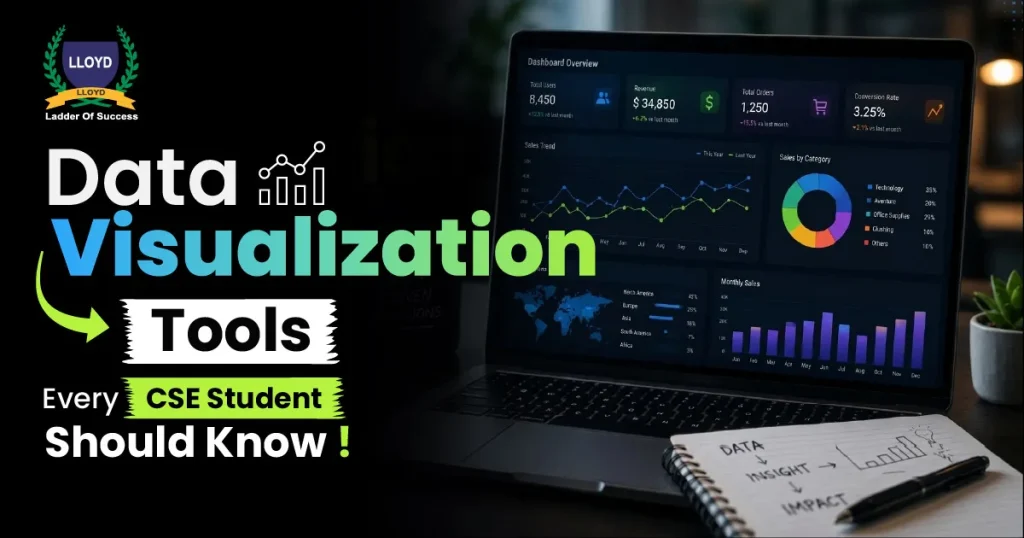
Data visualization helps transform complex datasets into charts, graphs, dashboards, and visual reports that make information easier to understand. For students pursuing Computer Science Engineering (CSE), learning data visualization tools is becoming an essential skill for future careers in technology.
From artificial intelligence and data science to cybersecurity and software development, industries increasingly rely on professionals who can analyze and present data clearly. Students who understand visualization tools gain an advantage in internships, projects, placements, and long-term career growth.
What Is Data Visualization?
Data visualization refers to the graphical representation of data using visual elements such as:
- Charts
- Graphs
- Dashboards
- Heat maps
- Infographics
- Interactive reports
The goal is to simplify large amounts of information so users can identify trends, patterns, and insights quickly.
Instead of reading complicated spreadsheets or raw numbers, professionals use visualizations to make faster and smarter decisions.
Why CSE Students Should Learn Data Visualization
Modern technology careers are no longer limited to coding alone. Companies expect engineers to analyze data, interpret trends, and communicate findings effectively.
Key Reasons Data Visualization Is Important
- Helps simplify complex datasets
- Improves analytical thinking
- Supports better decision-making
- Enhances project presentations
- Increases employability in tech industries
Students exploring different BTech Specializations often notice that visualization skills are useful across domains like AI, software development, cybersecurity, and cloud computing.
How Data Visualization Connects with Emerging Technologies
Data visualization is closely connected to several fast-growing technology fields.
Artificial Intelligence
AI systems generate large datasets that require interpretation and monitoring. Visualization tools help engineers analyze machine learning performance and predictions.
Data Science
Data scientists use dashboards and charts to explain insights and business trends clearly.
Cybersecurity
Cybersecurity teams use visual dashboards to monitor threats, unusual activities, and system vulnerabilities in real time.
IoT and Smart Systems
Connected devices continuously generate data that must be visualized for monitoring and analysis.
Students interested in building a long-term career in tech should understand how visualization supports these emerging technologies.
Top Data Visualization Tools Every CSE Student Should Know
1. Microsoft Power BI
Power BI is one of the most popular business intelligence and data visualization tools used by companies worldwide.
Key Features
- Interactive dashboards
- Real-time analytics
- Easy integration with databases
- Drag-and-drop interface
Why Students Should Learn It
Power BI is widely used in industries such as finance, healthcare, marketing, and IT. Learning it can improve placement opportunities and practical project skills.
It is especially useful for students interested in data science and analytics careers.
2. Tableau
Tableau is known for creating visually attractive and interactive dashboards.
Features of Tableau
- Advanced visual analytics
- Real-time data visualization
- Interactive storytelling dashboards
- Easy data integration
Career Advantages
Many companies prefer Tableau professionals for business intelligence and analytics roles. It is highly valuable for students working on data-focused projects.
3. Python Visualization Libraries
Python is one of the most important programming languages in modern technology.
Several Python libraries help create powerful visualizations.
Popular Libraries
- Matplotlib
- Seaborn
- Plotly
- Bokeh
Why It Matters
Python visualization tools are essential for students interested in AI, automation, and machine learning projects.
Students exploring artificial intelligence careers often use Python-based visualization tools to analyze datasets and model performance.
4. Microsoft Excel
Although simple compared to advanced tools, Excel remains widely used across industries.
Common Visualization Features
- Charts and graphs
- Pivot tables
- Dashboards
- Data filtering
Why CSE Students Should Learn Excel
Excel provides a strong foundation for understanding data organization and reporting. Many internship projects and beginner-level analytical tasks still rely heavily on Excel.
5. Google Data Studio
Google Data Studio allows users to create cloud-based dashboards and reports.
Key Benefits
- Free to use
- Cloud integration
- Real-time collaboration
- User-friendly interface
Industry Relevance
Companies use it for website analytics, marketing reports, and performance tracking.
6. Apache Superset
Apache Superset is an open-source business intelligence platform designed for modern data exploration.
Features
- Interactive dashboards
- SQL support
- Advanced analytics
- Scalable architecture
Why Students Should Learn It
Open-source tools help students gain practical exposure without licensing costs.
7. D3.js
D3.js is a JavaScript library used for creating advanced web-based visualizations.
What Makes It Unique
- Highly customizable
- Interactive visualizations
- Web integration support
Best For
Students interested in frontend development and interactive data presentation.
8. Qlik Sense
Qlik Sense is another modern analytics and visualization platform.
Important Features
- AI-assisted analytics
- Interactive dashboards
- Self-service reporting
Career Benefits
Learning enterprise-level tools improves employability for analytics and reporting roles.
Real-World Applications of Data Visualization
Data visualization is widely used across industries to simplify complex information and support faster decision-making. It helps organizations identify patterns, monitor performance, and communicate insights more effectively.
Healthcare
Hospitals and healthcare organizations use data visualization to analyze patient records, monitor disease outbreaks, and improve treatment planning. Visual dashboards also help doctors and administrators track hospital performance and resource management efficiently.
Finance
Banks and financial institutions use dashboards and visual reports for fraud detection, investment analysis, and risk management. Data visualization helps financial experts identify unusual activities and make faster data-driven decisions.
Manufacturing
Manufacturing industries use real-time dashboards to monitor production efficiency, machine performance, and supply chain operations. Visual analytics also help reduce downtime, improve productivity, and optimize industrial processes.
Cybersecurity
Cybersecurity professionals use data visualization tools to monitor network traffic, detect suspicious activities, and identify cyber threats quickly. Students interested in cybersecurity careers often work with monitoring dashboards that provide real-time security insights and threat analysis.
Supporting Robotics and Intelligent Machines
Industrial robots are now widely used in automotive, electronics, and manufacturing sectors.
Electronics engineers contribute by designing:
- Robot control systems
- Motor drivers
- Communication circuits
- Embedded controllers
These systems allow robots to perform tasks with precision and consistency.
Students interested in robotics often explore BTech Specializations related to electronics, automation, and intelligent systems because of their future career potential.
Common Mistakes Students Should Avoid
Many students start learning data visualization tools without a proper strategy, which can slow down their progress. Avoiding common mistakes can help students build stronger analytical and technical skills more effectively.
Learning Too Many Tools at Once
Students often try to learn multiple visualization platforms simultaneously, which can create confusion and reduce learning efficiency. It is better to master one or two beginner-friendly tools before moving to advanced software and frameworks.
Ignoring Practical Projects
Visualization skills improve significantly through hands-on practice and real-world projects. Building dashboards, analyzing datasets, and creating reports help students understand how visualization works in actual industry scenarios.
Avoiding Programming Basics
Programming knowledge plays an important role in advanced data visualization and analytics. Learning languages like Python and SQL helps students create customized visualizations and work with large datasets more effectively.
Focusing Only on Theory
Many students spend too much time learning concepts without applying them practically. Industry recruiters usually value practical implementation skills, project experience, and problem-solving abilities more than theoretical knowledge alone.
Key Takeaways
- Data visualization helps convert complex data into understandable insights
- CSE students should learn tools like Power BI, Tableau, Python libraries, and Excel
- Visualization skills are important in AI, cybersecurity, analytics, and software development
- Practical projects and real-world datasets improve learning significantly
- Strong visualization skills increase employability and career opportunities
Choosing industry-focused engineering programs helps students stay future-ready
Improving Energy Efficiency in Industries
Energy management has become a major priority for industries.
Electronics engineers design systems that help:
- Reduce power consumption
- Optimize industrial equipment performance
- Monitor energy usage
- Improve sustainability
Smart energy systems not only reduce costs but also support environmentally responsible manufacturing practices.
Frequently Asked Questions
1. What are data visualization tools used for?
Data visualization tools help convert complex datasets into charts, graphs, dashboards, and visual reports for easier understanding and analysis.
2. Which data visualization tool is best for beginners?
Microsoft Excel and Power BI are considered beginner-friendly tools for students starting with data visualization.
3. Why should CSE students learn data visualization?
Data visualization helps CSE students improve analytical thinking, project presentation skills, and career opportunities in AI, data science, and cybersecurity.
4. Is Python useful for data visualization?
Yes, Python offers powerful visualization libraries like Matplotlib, Seaborn, and Plotly that are widely used in analytics and AI projects.
5. What careers require data visualization skills?
Careers such as data analyst, AI engineer, cybersecurity analyst, business intelligence analyst, and data scientist require strong data visualization skills.
Lloyd---
Discover More Topics –
Recent Blogs